FOTOBOOK: An interview with Zvezdan Reljić
Eve Cocks: Fotobook features a range of works by photographers from all over the globe. Can you tell us about the publication’s genre?
Zvezdan Reljić: Fotobook is a limited edition photography magazine presenting photographs that are real and untouched by commercial pressures or unnecessary processing. There is no restricting genre; each photograph is a story that reveals the way the photographer views a particular slice of life.
EC: Certain publishing houses decide whether a body of work should be published based on the quality and marketability of the work. Can you tell us about your process of choosing works?
ZR: Regarding the quality of a photograph, even trying to explain a single photograph is very subjective; everyone will see something different. Even if someone hates what the photograph presents, that doesn’t mean that it is of bad quality. For me, the photos I take into consideration are those which I think will make the viewer remember them and would wish to see them again.
As for marketability, I’m not interested in that.
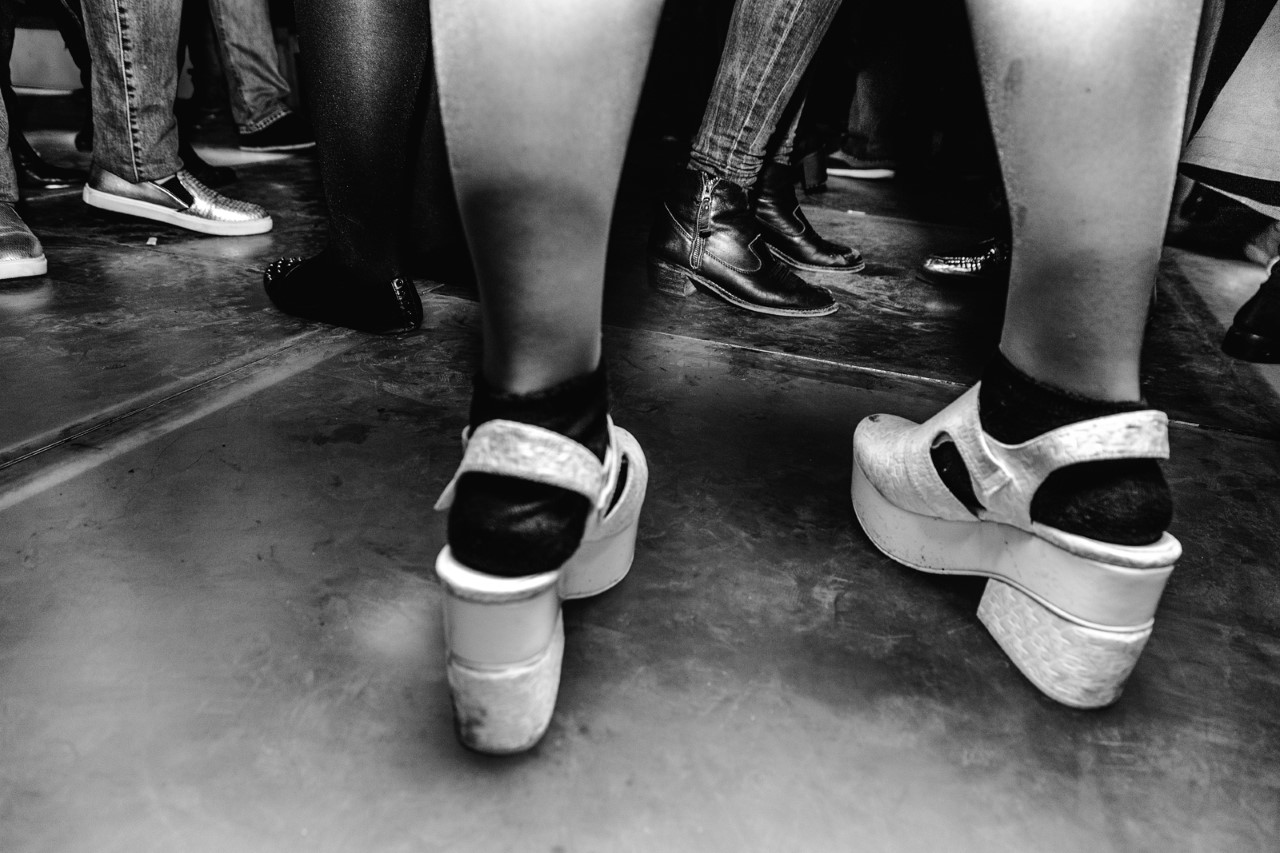
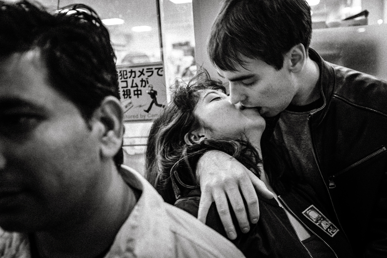
Photo © Myriam Boulos – Fotobook #2
EC: The style of the magazine is inspired by Japanese Photobooks of the 1960s and ‘70s. Could you elaborate?
ZR: I see this relating mainly to page layout; most of the photographs bleed out of the page and vertical photos bleed into the spine on a spread. Also, there is no text or numeration on the pages.
That style was first introduced in 1968 when the now legendary, experimental Japanese photography magazine Provoke, with its subtitle of Provocative Materials for Thought, was launched as a new medium intended to liberate photography from the restrictions of language.
Provoke lasted only for three issues, but it influenced Japanese photography immensely in the 1970s and ‘80s.
I think Provoke’s statement that it “stood in opposition to the photography establishment” is equally valid in the present time where social media is rife with overly post-processed images that obey ‘Instagram aesthetics’. Given that these photos use carefully premeditated compositions and colours, most of the images end up looking alike. In turn, the viewers are not engaged, and they scroll down quickly without giving the images a second look. Basically, that is what Fotobook strongly opposes through its content.
So I admit that I am fond of Provoke’s manifesto. That said, Fotobook magazine, having just been launched last month, is living and changing and, probably, the first change I will consider is the introduction of colour photographs in the near future.
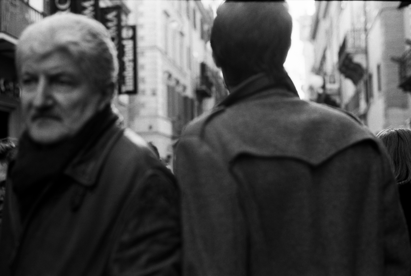
Photo © Sarah Chircop – Fotobook #3
EC: Can you talk about the challenges that you face in making this publication?
ZR: Issuing a monthly publication is a challenge. Firstly, financially, Fotobook doesn’t have adverts and depends on pre-orders and subscriptions. Another challenge is obviously content: the need to keep the same quality level whilst being able to surprise readers with each new issue. I rely mostly on connections I managed to make over the years with international photography collectives and individual photographers.
The magazine is just over one month old; therefore many people who make photos that would fit the Fotobook style may not yet be aware of this new publication. Also, there are others who may hesitate to submit photos to a new and growing publication as opposed to an established one.
This will hopefully change soon as the following is growing and I have had amazing feedback after the first issue, which featured my photographer friends from Malta with whom I have collaborated on many projects in the past years. The second issue has featured photographs by only female photographers from several different countries.
EC: What other changes or additions do you have in mind considering the feedback you have received after the first two issues?
ZR: In the just-released second issue, I have already introduced some needed minor layout changes. What I am working on now, as an addition to the monthly publication, is a separate short-run A5 photo book with over 100 pages. This will be issued periodically and will be included as a present to each Fotobook subscriber. Additional copies will be available for sale at the Fotobook online shop.
Each A5 photo book in this series will be loosely curated, having a thematic stream that runs through the book while allowing for a broad exploration of the subject matter. So there is plenty of space for creative expression that explores a theme central to each book.
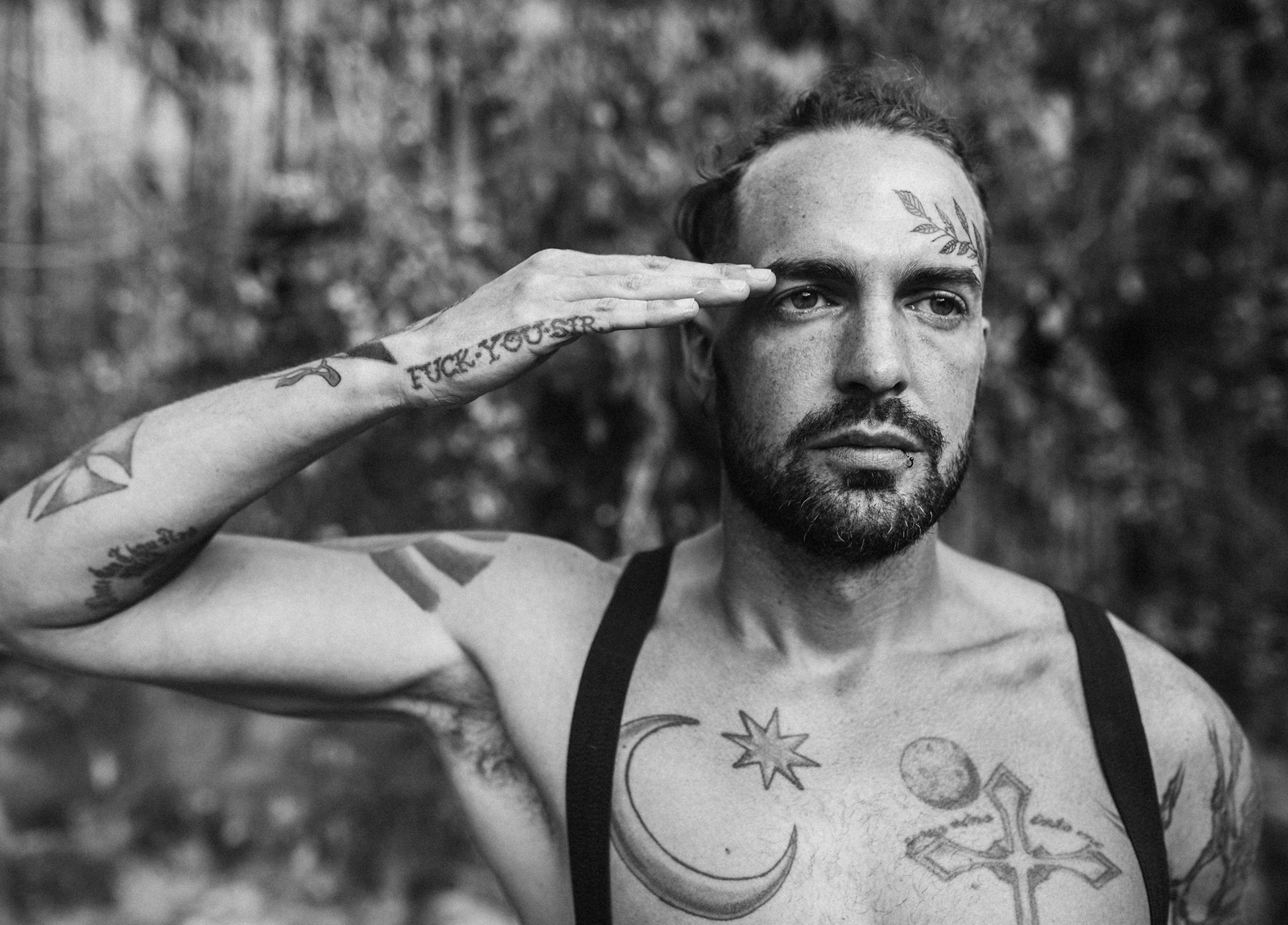
Photo © Dragana Rankovic – Fotobook #2
EC: How do you see Fotobook in the near and distant future?
ZR: I understand that a small independent publication like this is aimed at a very narrow audience. Fotobook has been very well received within the creative community in Malta, and there has also been interest from some small indie bookshops around Europe. This might be the first photography magazine from Malta to be distributed abroad monthly. Fotobook’s survival depends on the number of copies and subscriptions sold for the next several months. Hopefully, I will be able to print more copies and expand distribution to other countries.
Whoever has seen a copy of the magazine, from artists and photographers to government or postal service officials, have passed favourable comments.
So it seems that Fotobook will probably last much longer than the three issues of Japanese Provoke!
Zvezdan Reljic is a Yugoslav-Maltese artist and publishing industry specialist with over 20 years of hands-on experience in photography, pre-press, printing and graphic design. He graduated from the Graphic Arts School in Belgrade with a specialisation in photography reproduction. Along the way, he has integrated all the new technologies of digital imaging and pre-press but always kept close to heart his love for the printer’s craft. During his career, he has managed several newspapers and magazine design departments and worked as a consultant on numerous publishing projects. Zvezdan currently runs his own publishing house and graphic design and film photography studio. He works primarily in film photography and darkroom printing. His publishing venture, Ede Books, specialises predominantly in the production of socially engaged books and ‘art books’ – books of rich, visual content that touch upon architecture, photography, design and urban culture.
CHECK OUT FOTOBOOK ON INSTAGRAM
Featured Image: Photo © Jan Rockar – Fotobook #3